Goal
Create a logo for an existing company that describes translation services offered to scientific and technical communities.
Solution
Translation is a process of change. As one language is translated into another, each word is replaced with something new, yet the meaning stays the same. The phoenix is an apt symbol of this process. It dies and is then reborn from its own ashes, taking on an identical form in a new life.
The symbol combines elements of a bird and of flames. Elongated, raised wings recall fire reaching skyward, and feathers are interpreted as licks of flame caressing and creating a reincarnated creature. Placed atop the wordmark, the reformed bird appears to rise from the words beneath — a visual expression of the company's services.
Scientific and technical translation is more challenging, as the final product must be indistinguishable from its predecessor — a mistranslated number or unit of measure can mean the difference between equipment that works as expected and a dangerous disaster. A strong, solid wordmark communicates confidence, both in the company and its product.
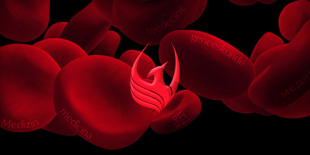
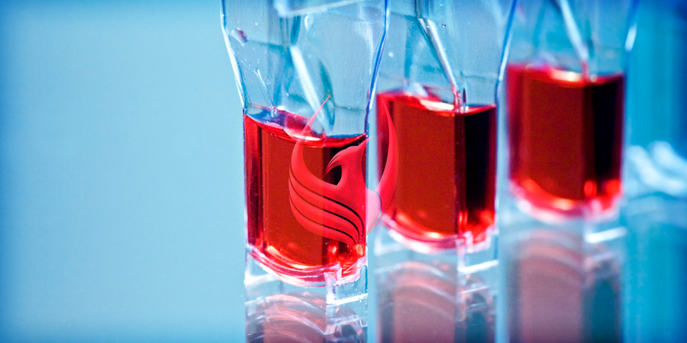
Bright red and sky blue colors combine the concept of fire already present in the logo with the technical and scientific applications that require precision services. Shading allows the logo to be used in high-contrast and low-contrast applications.

