Goal
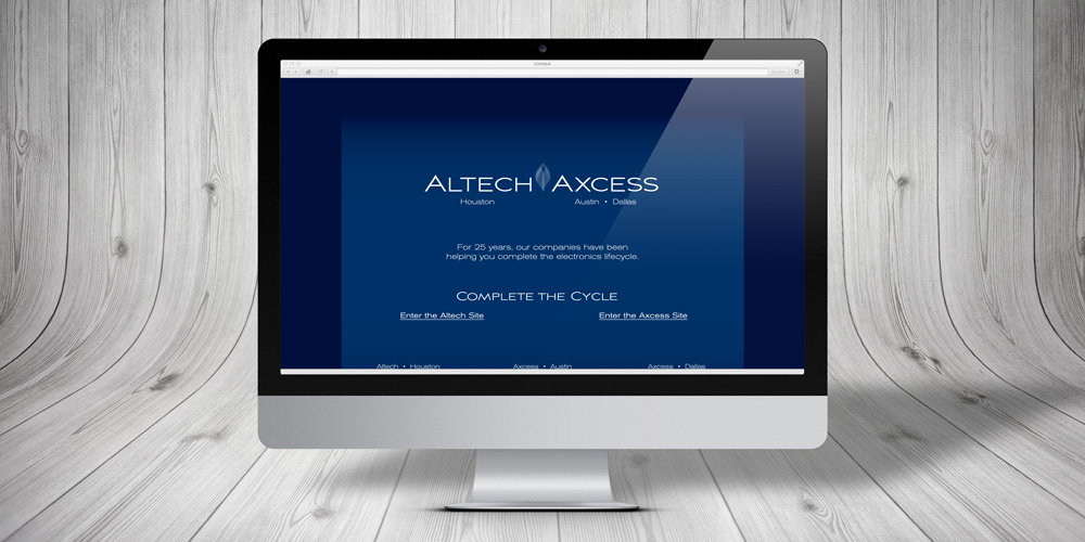
When two electronics recycling companies were merged, each already owned a site and URL. Each location wanted to maintain its own content and URL to better serve existing customers. The two sites were redesigned using a similar look to improve brand recognition, but each maintained its existing URL. A single page was also developed to direct new customers to the two sites, using a new slogan for its URL.
Solution
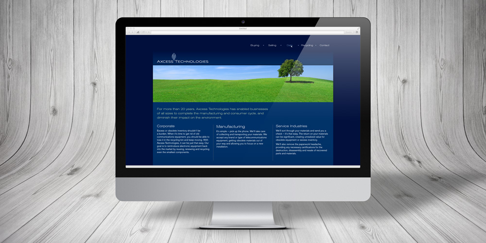
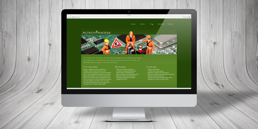
Each company was tasked with building and maintaining its own site, adding new information relevant to customers in each location. A single design with two related color schemes allowed each location to produce unique content while adhering to the cohesive look of the new, merged organization.
A new landing page was developed to bind the two sites together. The page is accessed via the new URL, based on the new slogan. From there, new customers can choose the site for their city. The original URLs were retained for the bulk of the old sites, allowing existing customers to use the familiar URL and existing bookmarks.
Large, colorful header images were developed that include the images of nature used in other materials, and additional photos are included that more closely describe the processes used in each facility – tiny workers take circuit boards apart, some wearing hazmat suits as they carefully remove parts for reuse or recycling.